Toolbar
The toolbar allows you to create buttons with additional actions upon clicking, such as saving or deleting data. Each toolbar button has customizable visibility, disabled status, icon, text, and a customizable method that will be invoked when the button is clicked.
Usage
Let's explore the two ways of creating a toolbar:
Basic Vue
The VcBlade component has a toolbar-items prop, that accepts an array of objects with id, title, icon, clickHandler, and other properties. For example:
const bladeToolbar = ref<IBladeToolbar[]>([
    {
        id: "refresh",
        title: 'Refresh',
        icon: "fas fa-sync-alt",
        async clickHandler() {
            // your custom refresh logic here
        },
    },
]);
Dynamic Views
To create a toolbar schema, pass a toolbar property to the view schema object. The sample schema might look as follows:
import { DynamicDetailsSchema } from "@vc-shell/framework";

const schema: DynamicDetailsSchema = {
    settings: {
        // ...
        toolbar: [
            {
                id: "refresh",
                title: 'Refresh',
                icon: "fas fa-sync-alt",
                method: "refresh",
            },
        ],
    },
};
This schema creates a toolbar with one button featuring refresh id, Refresh title, fas fa-sync-alt icon, and refresh method. However, the button remains invisible until you add a create method to the toolbarOverrides object in the view composable scope. See instruction below to learn how to do this.
Note
You can specify the localization key for the title. Under the hood, vue-i18n is used.
Bind properties and methods
To add interactivity to your toolbar button, add the refresh method to your toolbarOverrides object:
const useList = (args: // ...): UseList => {
    const scope = ref<ListScope>({
        // ...
        toolbarOverrides: {
            refresh: () => {
                // your custom logic here
            },
        },
    });
}
Alternatively, create object with visible and disabled properties along with the clickHandler method:
const useList = (args: // ...): UseList => {
    const scope = ref<ListScope>({
        // ...
        toolbarOverrides: {
            refresh: {
                clickHandler(bladeContext) {
                    // your custom logic here
                },
                visible: true,
                disabled: false,
            }
        }
    });
}
The visible and disabled properties can be a boolean, a function, or even a computed property that returns a boolean value.
TheclickHandler method also has an argument with the provided bladeContext object.
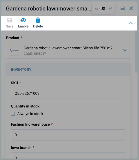
 DynamicBladeList Blade Context
DynamicBladeForm Blade Context
Creating toolbar without schema
If you want to create a toolbar without a schema, for example if you want to generate it dynamically, you can use this approach. A dynamically generated toolbar can be an array of objects, an object with key-toolbar object pairs, or a function that returns an array of objects. When creating a toolbar using a function, it receives the blade context as an argument. In this example, we will look at how to create a toolbar using an array of objects:
const useList = (args: // ...): UseList => {
    const toolbar = ref([]) as Ref<IBladeToolbar[]>;
    // ...
    const scope = ref<ListScope>({
        // ...
        toolbarOverrides: computed(() => toolbar.value)
    });

    // Here we executes createToolbar on blade mount
    watch(
        () => args?.mounted.value,
            async () => {
                createToolbar();
            },
    );

    // Here we want create toolbar with single refresh button
    const createToolbar = () => {
        toolbar.value.push({
            title: 'Refresh',
            icon: "fas fa-refresh",
            async clickHandler() {
                // your custom logic here
            },
            disabled: !args.props.param,
        });
    };
}
Note
You should use this approach only if you unable to create toolbar using schema, for example if you want to generate it dynamically from retrieved data from API.
Toolbar API
The Toolbar API provides a structured set of tools for creating dynamic and customizable toolbars in your application.
IBladeToolbar interface
The IBladeToolbar interface defines the properties available for configuring individual toolbar items. Use this interface to customize the appearance and behavior of each toolbar item within your application.
| Property | Type | Description |
|---|---|---|
| id | string |
The Id of the toolbar item. |
| icon | string | (() => string) |
The icon of the toolbar item. It can be a string or a function that returns a string. |
| disabled | boolean | ComputedRef<boolean \| undefined> |
Whether the toolbar item is disabled. |
| dropdownItems | IBladeDropdownItem[] |
An array of dropdown items for the toolbar item. |
| title | string | Ref<string> |
The title of the toolbar item. It can be a string or a ref to a string. |
| isVisible | boolean | Ref<boolean \| undefined> | ComputedRef<boolean \| undefined> |
Shows if the toolbar item is visible. |
| clickHandler | ((app?: Record<string, any> \| CoreBladeExposed \| null) => void) \| undefined |
The click handler function for the toolbar item. It takes an optional app object as a parameter. |