Gallery
Gallery represents an image gallery component with upload and preview.
Usage
Include the vc-gallery component in your Vue application, providing theming and enhanced functionality to your image inputs.
Create a basic component as follows:
Gallery API
API empowers you to create a dynamic and interactive dynamic component to customize its appearance and behavior.
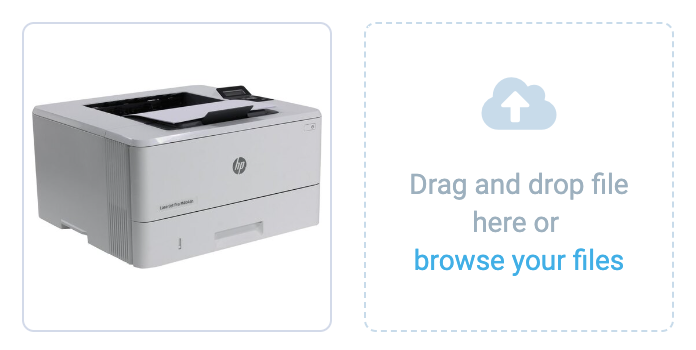
Basic Vue
You can easily incorporate the vc-gallery component into your Vue applications using simple templates.
Props
To customize the appearance and behavior of your component, use the following props:
| Property and Type | Description |
|---|---|
images {ICommonAsset[]} |
Array of images for the gallery. |
disabled {boolean} |
Indicates if the gallery is disabled. |
required {boolean} |
Indicates if the gallery is required. |
label {string} |
Label for the gallery. |
tooltip {string} |
Tooltip text for the gallery. |
tooltipIcon {string} |
Icon for the tooltip. Default: fas fa-info |
uploadIcon {string} |
Icon for the upload button. Default: fas fa-upload |
multiple {boolean} |
Indicates if multiple images can be uploaded. |
variant {"gallery"}, {"file-upload"} |
Variant of the gallery component. Default: gallery |
itemActions {{preview: boolean, edit: boolean, remove: boolean}} |
Actions to be displayed for each image in the gallery. Default: () => ({ preview: true, edit: true, remove: true }) |
hideAfterUpload {boolean} |
Indicates if to hide the upload overlay after uploading files. |
rules {string}, {Record |
Validation rules for the gallery. |
name {string} |
Name of the gallery. Default: Gallery |
loading {boolean} |
Indicates if the gallery is in a loading state. |
Emits
To effectively interact with the component, use the emitted events:
| Name | Parameters | ReturnType | Description |
|---|---|---|---|
upload |
files: FileList, startingSortOrder?: number |
void |
Emits files to upload with initial sortOrder. |
sort |
sorted: ICommonAsset[] |
void |
Emits an sorted array. |
edit |
image: ICommonAsset |
void |
Emits image to edit. |
remove |
image: ICommonAsset |
void |
Emits image to remove. |
Dynamic Views
To dynamically integrate the vc-gallery component into your views, use the schema interface:
interface GallerySchema {
    id: string;
    component: "vc-gallery";
    label?: string;
    property: string;
    rules?: IValidationRules;
    tooltip?: string;
    hideAfterUpload?: boolean;
    actions?: {
        preview: boolean;
        edit: boolean;
        remove: boolean;
    };
    disabled?: {
        method: string;
    };
    visibility?: {
        method: string;
    };
    update?: {
        method: string;
    };
    horizontalSeparator?: boolean;
}
To incorporate the component into your dynamic applications, define the following properties:
| Property and Type | Description |
|---|---|
id {string} |
The unique Id for the vc-gallery component. |
component {vc-gallery} |
Component used in schema. |
label {string} |
Label for the gallery. Also available interpolation {} syntax based on current element context. You can specify the localization key for the label. Under the hood, vue-i18n is used. |
property {string} |
Property name that is used for binding gallery value to blade data. Supports deep nested properties like property[1].myProperty. Additionally, you have the flexibility to bind computed property that returns a value. Computed property should be defined in the blade scope. |
rules {IValidationRules} |
Validation rules for the gallery. It uses VeeValidate validation rules. |
tooltip {string} |
Tooltip text for the gallery label. You can specify the localization key for the tooltip. Under the hood, vue-i18n is used. |
hideAfterUpload {boolean} |
Indicates if the upload overlay should be hidden after uploading files. Default: false |
actions {{preview: boolean, edit: boolean, remove: boolean}} |
Actions to be displayed on hover for each image in the gallery. Default: {preview: true, edit: true, remove: true} |
disabled {{method: string}} |
Disabled state for component, could be used to disable gallery based on some conditions. Method or variable should be defined in the blade scope and should return a boolean value. |
visibility {{method: string}} |
Visibility state for component, could be used to hide gallery based on some conditions. Method or variable should be defined in the blade scope and should return a boolean value. |
update {{method: string}} |
Method to call when the gallery value is updated. It gets changed value, schema property name and field internal context as arguments. Method should be defined in the blade scope. |
horizontalSeparator {boolean} |
Adds a horizontal separator line after the component. |
Example
The gallery allows displaying images from an array of images, as well as uploading, previewing, editing, and deleting them. It has customizable actions for images, such as viewing, editing, and deleting.
To upload images, use the assetsHandler key in the details composables scope. assetsHandler has an interface for both images and assets, but in this case, we need the image interface. It includes a loading state, upload, remove, and edit methods. You can either use custom methods or the useAssets composable provided in the @vc-shell/framework.
useAssets composable
The useAssets composable includes asset processing methods - upload, edit, remove - as well as a loading state. The interface of the useAssets composable looks like this:
interface IUseAssets {
  upload: (files: FileList, uploadPath: string, startingSortOrder?: number) => Promise<ICommonAsset[]>;
  remove: (filesToDelete: ICommonAsset[], initialAssetArr: ICommonAsset[]) => ICommonAsset[];
  edit: (updatedFiles: ICommonAsset[], initialAssetArr: ICommonAsset[]) => ICommonAsset[];
  loading: ComputedRef<boolean>;
}
| Property and Type | Description |
|---|---|
upload {(files: FileList, uploadPath: string, startingSortOrder?: number) => Promise |
Method for uploading files. Accepts a FileList object, an upload path, and an optional starting sort order. Returns a promise that resolves to an array of ICommonAsset objects. |
remove {(filesToDelete: ICommonAsset[], initialAssetArr: ICommonAsset[]) => ICommonAsset[]} |
Method for removing files. Accepts an array of ICommonAsset objects to delete and the initial array of ICommonAsset objects. Returns an array of ICommonAsset objects after removing the specified files. |
edit {(updatedFiles: ICommonAsset[], initialAssetArr: ICommonAsset[]) => ICommonAsset[]} |
Method for editing files. Accepts an array of ICommonAsset objects to update and the initial array of ICommonAsset objects. Returns an array of ICommonAsset objects after updating the specified files. |
loading {ComputedRef |
Computed property that returns a boolean indicating whether the assets are currently being loaded. |
Now let's look at an example of connecting gallery actions in the details composable of a sample vc-app:
As you can see, in the upload and edit methods, we need to transform ICommonAsset objects into Image class objects from the client's API to use them in the gallery. This is necessary because ICommonAsset lacks some fields present in the Image class. Since images in the gallery often have their sortOrder, we can obtain the sortOrder of the last existing element in the array of images and pass it to the upload method so that the uploaded images have a sortOrder following the last existing one.
A basic example of a composable for image processing can be found in the vc-app sample folder in VirtoCommerce/.vc-shell repository: useAssets. Since dynamic views default to using this interface, it's essential to adhere to this specific writing style.