Data field
Data field is used to display a field label and some static data. It can be used to display text, date, date-ago and links. It also has ability to copy displayed value.
Usage
Include the vc-field component in your Vue application, providing theming and enhanced functionality to your data field inputs.
Create a basic data field as follows:
Field API
API empowers you to create dynamic and interactive data field components to customize its appearance and behavior.
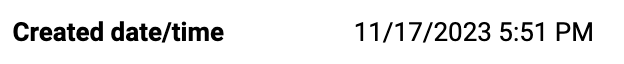
Basic Vue
You can easily incorporate the vc-field component into your Vue applications using simple templates.
Props
To customize the appearance and behavior of your data field, use the following props:
| Property and Type | Description |
|---|---|
label? {string} |
Field label. |
tooltip? {string} |
Field tooltip information. |
type? {"text"}, {"normal"}, {"date"}, {"date-ago"}, {"link"} |
Field type. Default: text |
modelValue? {any} |
Field content. |
copyable? {boolean} |
Add button for field content copying. |
Dynamic Views
To dynamically integrate the vc-field component into your views, use the schema interface:
interface FieldSchema {
    id: string;
    component: "vc-field";
    label?: string;
    tooltip?: string;
    property: string;
    variant?: "date-ago" | "date" | "link" | "text" | "email";
    copyable?: boolean;
    visibility?: {
        method: string;
    };
    horizontalSeparator?: boolean;
    orientation?: "horizontal" | "vertical";
    aspectRatio?: [number, number];
}
To incorporate the data field into your dynamic applications, define the following properties:
| Property and Type | Description |
|---|---|
id {string} |
The unique Id for the vc-field component. |
component {vc-field} |
Component used in schema. |
label {string} |
Label for the field. Also available interpolation {} syntax based on current element context. You can specify the localization key for the label. Under the hood, vue-i18n is used. |
tooltip {string} |
Tooltip text for the field label. You can specify the localization key for the tooltip. Under the hood, vue-i18n is used. |
property {string} |
Property name that is used for binding field value to blade data. Supports deep nested properties like property[1].myProperty. Additionally, you have the flexibility to bind computed property that returns a value. Computed property should be defined in the blade scope. |
variant {string} |
Field variant. Default: text |
copyable {boolean} |
Specification whether the field is copyable or not. |
visibility {{method: string}} |
Visibility state for component, could be used to hide field based on some conditions. Method or variable should be defined in the blade scope and should return a boolean value. |
horizontalSeparator {boolean} |
Adds a horizontal separator line after the component. |
orientation {"horizontal"}, {"vertical"} |
Field orientation. Default: vertical |
aspectRatio {[number, number]} |
Field columns aspect ratio. Uses CSS flex-grow property under the hood. Default: [1,1]. |