Navigation
In the VC Shell application, navigation is a fundamental aspect of managing modules and interacting with different blades. This guide explores the various elements of navigation and how to efficiently work with them.
The application has its own routing, which is based on the vue router and provided by the useBladeNavigation composable.
useBladeNavigation is a custom composite responsible for navigating between modules, opening and closing new blades, and their interaction with each other.
The Vue router is responsible for navigation within the application, handling clicks in the application menu, and also supporting opening pages via direct links and saving page state after page refresh.
The scaffolded application already has all the initial settings for working with navigation, but let's have a look at the details.
Navigation elements
The main navigation elements in the application are blades. Each blade is a separate page with its own functionality and template. Blades are not connected to each other, but can be used together by means of special methods.
The workspace consists of blades. Each new blade is added to the right, hiding the first ones so that only two are available at a time. You can open and close new blades, and work with different data at the same time. The blade is a fully customizable entity that follows application design patterns.
The main blades elements are:
-
Header. The blade header contains the title of the blade, various actions such as the Expand and Collapse Blade buttons, and an area where you can place data as you see fit, such as product type or blade status.
-
Toolbar. The blade toolbar is a place where you can place any combination of actions with this blade. It could be actions like refresh, delete, etc.
-
Content. The blade content is a place, where all the content of the blade is located. It can be tables, forms, and any other data that needs to be displayed in it.
-
Top bar. The blade top bar is an application component that can contain various data and components. It is fully customizable, but by default it contains the language selection component, notification component, and user information. It is also responsible for displaying the blade name in the mobile version.
-
Navigation menu. This element is a part of the application menu system.
Quick Start for Navigation
To get started with the VC Shell application's navigation system, import the useBladeNavigation composable from the @vc-shell/framework package:
useBladeNavigation is a custom composition API function designed for working with blade navigation. It works hand in hand with the VcBladeNavigation component from @vc-shell/framework. This component manages the workspace blade of the module and other blades, which may or may not have their paths defined.
Blade Components Structure
- Each blade comprises a template with a
VcBladecomponent serving as the root. TheVcBladecomponent is central to creating a blade:
- Every blade comes with its default props interface:
- Each blade also emits its events based on your requirements:
- If you want your blade to have its path, you can use the
defineOptionsmacro:
- If you want your blade to have its own navigation menu item, you can use the
defineOptionsmacro:
- To create a blade toolbar, make use of the IBladeToolbar interface:
Creating Navigation Menu Items
To create a menu item, use the defineOptions macro in the blade component. This macro allows you to define the blade's URL and menu item. The menu item is an object with the following interface:
| Property | Type | Description |
|---|---|---|
title |
string |
Menu item title. You can specify the localization key for the title. Under the hood, vue-i18n is used. |
icon |
string |
Menu item icon. |
group |
string |
Menu item group. Is used to group menu items with its provided name. If the path is not specified, the menu item is added to the root of the menu. You can specify the localization key for the group. Under the hood, vue-i18n is used. |
priority |
number |
Position priority. |
inGroupPriority |
number |
Position priority in group. |
Routing
The application's routing can be handled using the openBlade method from the useBladeNavigation composable:
To navigate to a module or open a new blade, use the async openBlade method. Pass the blade component you wish to navigate to as an argument.
Additionally, you can provide parameters, options, and two types of callbacks, namely onOpen and onClose, which execute when the blade is opened or closed, respectively:
Add Module to Application
Once you've created your blade template, it needs to be initialized. In the module's index.ts file, register it within the application using the createAppModule method. With this setup, you're ready to go:
Example
Navigation Actions
To open a new workspace, you can use the openBlade function from the useBladeNavigation composable with second argument isWorkspace === true . It offers the advantage of setting initial data when opening the blade. When using imported blade components with openBlade, remember to use Vue's markRaw method to prevent conversion to a proxy, thereby optimizing performance.
Alternatibely, you can use resolveBladeByName method to get blade component by its name.
To open the blade in the same workspace, use the openBlade function from the useBladeNavigation composable with second argument isWorkspace === false or without it:
To close a blade, emit a close:blade event from your blade component. The VcBlade component, which is used to construct blades, emits this event when the close button is clicked.
Alternatively, use the closeBlade function from the useBladeNavigation composable if you know the index of the blade you want to close:
Each blade can emit a parent:call event to invoke a method in its parent blade. To execute a method in the parent blade, expose it using defineExpose:
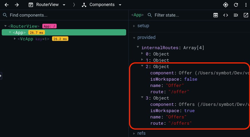
Overview of All Registered Blades in the Application
You can see all blades registered in the application with and without paths. To do so, use a browser extension called Vue Devtools.
-
To discover the blade's name, open
Vue Devtoolsand locateAppin the components tree. Clicking on it will reveal the component's state:
-
Identify the
providedoption within this state, which contains an array ofinternalRoutes. This array encompasses all registered blades from each module, whether they have their own URL or not: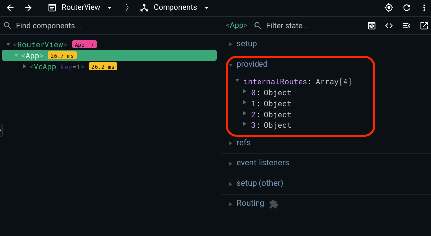
-
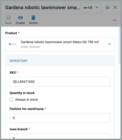
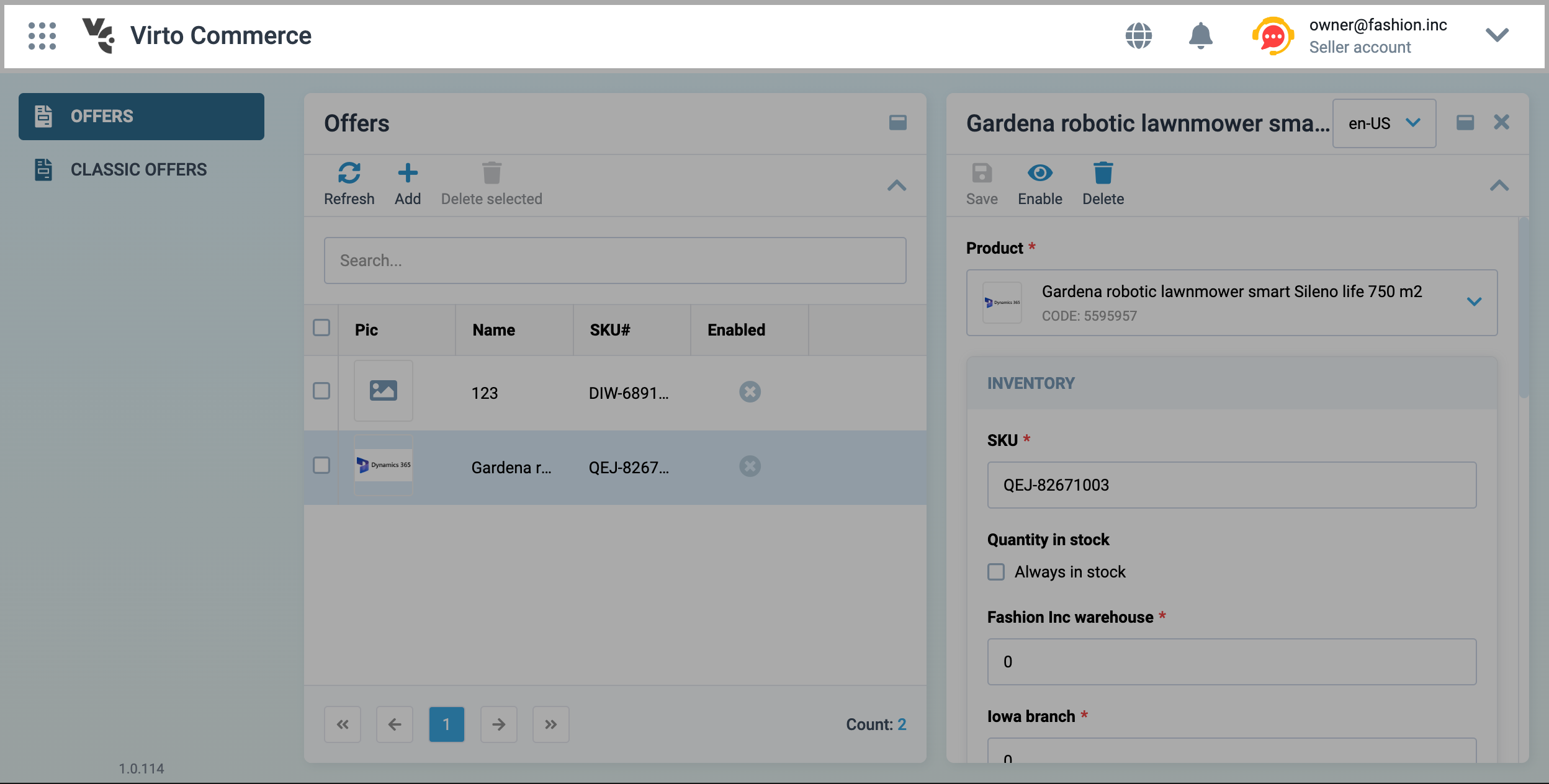
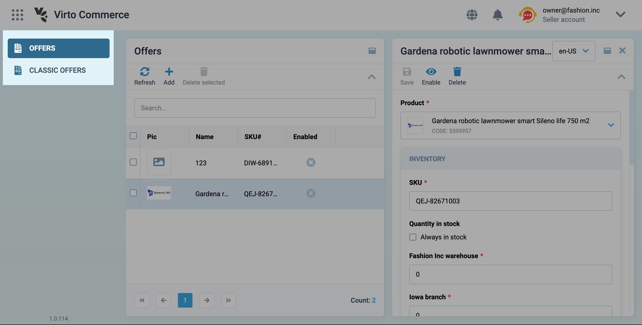
As an example, let's expand two objects of the
internalRoutesarray and see an example of registered blades that belong to theOffersmodule: