Status
The status component is used to display a status badge with customizable view and icon as well as its size, title, and badge content text.
Usage
Include the vc-status component in your Vue application, providing theming and enhanced functionality to your status inputs.
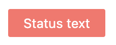
Create a basic status as follows:
Status API
API empowers you to create dynamic and interactive status components to customize its appearance and behavior.
Basic Vue
You can easily incorporate the vc-status component into your Vue applications using simple templates.
Props
To customize the appearance and behavior of statuses, use the following props:
| Property and Type | Description |
|---|---|
variant {"info"}, {"warning"}, {"danger"}, {"success"}, {"light-danger"} |
Status variant. |
outline {boolean} |
Whether the status is outlined or not. |
extend {boolean} |
Whether the status is extendable or not. |
Slots
To enhance the content of the vc-status component, use the slot system:
| Name | Description |
|---|---|
default |
Status content slot. |
Dynamic Views
To dynamically integrate the vc-status component into your views, use the schema interface:
interface StatusSchema {
    id: string;
    component: "vc-status";
    variant: "info" | "warning" | "danger" | "success" | "light-danger";
    icon?: string;
    iconVariant?: "warning" | "danger" | "success";
    iconSize?: "xs" | "s" | "m" | "l" | "xl" | "xxl" | "xxxl";
    title?: string;
    outline?: boolean;
    extend?: boolean;
    content?: {
        method: string;
    };
    visibility?: {
        method: string;
    };
    horizontalSeparator?: boolean;
}
To incorporate the status into your dynamic applications, define the following properties:
| Property | Description |
|---|---|
id {string} |
Identifier for the vc-status component. |
component {vc-status} |
Utilized component in the schema. |
variant {string} |
Type of status variant. |
icon {string} |
Icon featured in the status badge, utilizing AwesomeIcons package. |
iconVariant {string} |
Variant of the displayed icon. |
iconSize {string} |
Size of the icon. |
title {string} |
Title associated with the status. You can specify the localization key for the title. Under the hood, vue-i18n is used. |
outline {boolean} |
Specification of whether the status is outlined. |
extend {boolean} |
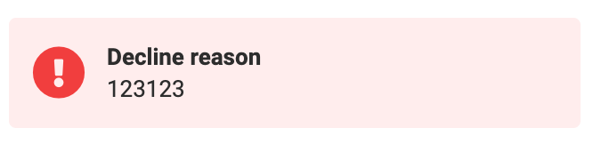
This setting allows to create status with header and content text. See the example below. |
content {{method: string}} |
Method for retrieving the status content. Method should be defined in the blade scope and should return a string value. |
visibility {{method: string}} |
State of visibility for the component, allowing you to hide the status based on certain conditions. The method or variable should be defined in the blade scope and should return a boolean value. |
horizontalSeparator {boolean} |
Adds a horizontal separator line after the component. |
Example
Status example with extend setting set to true: