Card
Card is a flexible and collapsible container component. The examples below illustrate how you can use the vc-card component to enhance your user interface.
Usage
Include the vc-card component in your Vue application, providing theming and enhanced functionality to your card inputs.
Card is created with a header property and default slot as its content.
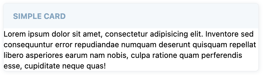
Create a basic static card with a labeled header as follows:
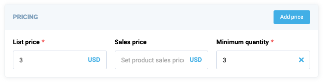
As the card has the ability of deep nesting, you can add other cards or controls to it and create complex UI interfaces.
Card API
API empowers you to create dynamic and interactive card components to customize its appearance and behavior.
Basic Vue
Integrate the vc-card component into your Vue applications using a simple template.
Props
To customize the appearance and behavior of cards, use the following props:
| Name and Type | Description |
|---|---|
header {string} |
The header of the component. |
icon {string} |
The icon associated with the component. |
isCollapsable {boolean} |
Specification whether the component is collapsible. |
isCollapsed {boolean} |
Specification whether the component is initially collapsed. |
fill {boolean} |
Specification whether the content of the card should fill available space. |
variant {"default"}, {"success"}, {"danger"} |
The variant of the component. |
Slots
To enhance the content of the vc-card component, use the slot system:
| Name | Description |
|---|---|
default |
Card content slot. |
actions |
Slot for any customizable component to show in the right corner of the card header |
Emits
To interact with the vc-card component, use the emitted events. The click event, triggered when the button is clicked, allows you to implement dynamic behaviors and responses within your application:
| Name | Parameters | ReturnType | Description |
|---|---|---|---|
header:click |
void |
void |
Emitted when the header is clicked. |
state:collapsed |
isCollapsedSta{boolean} | void |
Emitted when the card is collapsed or expanded. |
Dynamic Views
To dynamically integrate the vc-card component into your views, use the schema interface:
interface CardSchema {
    id: string;
    component: "vc-card";
    label: string;
    fields: ControlSchema[];
    action?: ButtonSchema & {
        method: string;
    };
    collapsible?: boolean;
    visibility?: {
        method: string;
    };
    horizontalSeparator?: boolean;
}
To incorporate the card into your dynamic applications, define the following properties:
| Property and Type | Description |
|---|---|
id {string} |
The unique Id for vc-card component. |
component {vc-card} |
Component used in schema. |
label {string} |
Card label that is displayed in the header. Also available interpolation {} syntax based on current element context. You can specify the localization key for the label. Under the hood, vue-i18n is used. |
fields {ControlSchema[]} |
Array of schemas for components that will be displayed inside the card. |
action {ButtonSchema & {method: string}} |
Action button that is displayed in the top right corner of the card. Could be used to trigger some actions. |
collapsible {boolean} |
Specification whether the card should be collapsed. |
visibility {{method: string}} |
Visibility state for the component, could be used to hide the card based on some conditions. Method or variable should be defined in the blade scope and should return a boolean value. |
horizontalSeparator {boolean} |
Adds a horizontal separator line after the component. |
Example
The card example with action button and fieldset component containing several inputs from vc-app project: