Input Currency
Input currency is an input component with a currency selector.
Usage
Include the vc-input-currency component in your Vue application, providing theming and enhanced functionality to your currency input.
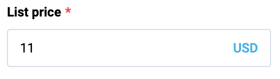
Create a basic currency input as follows:
To start using all the available input currency properties, specify the vc-input-currency component when creating the schema. For example:
{
    id: "inputCurrencyId",
    component: "vc-input-currency",
    label: "Input currency label",
    property: "inputCurrencyProperty",
    placeholder: "Input currency placeholder",
    optionProperty: "currency",
    optionValue: "value",
    optionLabel: "title",
}
Where optionProperty is an object array containing currency data, optionValue is the name of the property that contains the value of the currency, optionLabel is the name of the property that contains the label of the currency.
Currency array example:
Input Currency API
API empowers you to create dynamic and interactive currency input component to customize its appearance and behavior.
Basic Vue
You can easily incorporate the vc-input-currency component into your Vue applications using simple templates.
Props
To customize the appearance and behavior of your currency input, use the following props:
| Property and Type | Description |
|---|---|
modelValue {number}, {null}, {undefined} |
Model of the currency component. Use with a listener for 'update:price' event OR use v-model:price directive. |
label {string} |
Input label text. |
placeholder {string} |
Input placeholder text. |
hint {string} |
Input description (hint) text below input component. |
clearable {boolean} |
Appends clearable icon when a value is set; When clicked, model becomes null. |
prefix {string} |
Prefix. |
suffix {string} |
Suffix. |
name {string} |
Used to specify the name of the control. If not specified, it takes the value 'Field'. |
loading {boolean} |
Signals the user a process is in progress by displaying a spinner. |
debounce {string}, {number} |
Debounce amount (in milliseconds) for search input. Default: 0 |
disabled {boolean} |
Put component in disabled mode. |
autofocus {boolean} |
Focus field on initial component render. |
error {boolean} |
Does field have validation errors? |
errorMessage {string} |
Validation error message (gets displayed only if 'error' is set to 'true'). |
maxlength {string}, {number} |
Specify a max length of model. Default value: 1024. |
tooltip {string} |
Input tooltip information. |
required {boolean} |
Input required state. |
option {string} |
Option label. |
options {unknown[]} |
Available options that the user can select from; Default value: []. |
optionValue {OptionProp |
Property of option which holds the 'value'; Default value: id. |
optionLabel {OptionProp |
Property of option which holds the 'label'; Default value: title. |
Slots
To enhance the content of the vc-input-currency component, use the slot system:
| Slot | Description |
|---|---|
button |
Slot for custom dropdown open handler. It receives a scope object with a toggleHandler function. |
Emits
To effectively interact with the component, use the emitted events. The update:modelValue is triggered when the component's value undergoes a change. The update:option event is emitted when there is a modification in the option.
| Name | Parameters | ReturnType | Description |
|---|---|---|---|
update:modelValue |
value: string \| number \| null |
void |
Emitted when the value of the component changes. |
update:option |
value: unknown |
void |
Emitted when the option changes. |
Dynamic Views
To dynamically integrate the vc-input-currency component into your views, use the schema interface:
interface InputCurrencySchema {
    id: string;
    component: "vc-input-currency";
    label?: string;
    property: string;
    rules?: IValidationRules;
    placeholder?: string;
    tooltip?: string;
    optionProperty: string;
    optionValue?: string;
    optionLabel?: string;
    disabled?: {
        method: string;
    };
    visibility?: {
        method: string;
    };
    update?: {
        method: string;
    };
    horizontalSeparator?: boolean;
}
To incorporate the input into your dynamic applications, define the following properties:
| Property and Type | Description |
|---|---|
id {string} |
The unique Id for the vc-input-currency component. |
component {vc-input-currency} |
Component used in schema. |
label {string} |
Label for the input currency. Also available interpolation {} syntax based on current element context. You can specify the localization key for the label. Under the hood, vue-i18n is used. |
property {string} |
Property name that is used for binding input currency value to blade data. Supports deep nested properties like property[1].myProperty. Additionally, you have the flexibility to bind computed property that returns a value. Computed property should be defined in the blade scope. |
rules {IValidationRules} |
Validation rules for the input currency. Uses VeeValidate validation rules. |
placeholder {string} |
Placeholder text for the input currency. You can specify the localization key for the placeholder. Under the hood, vue-i18n is used. |
tooltip {string} |
Tooltip text for the input currency label. You can specify the localization key for the tooltip. Under the hood, vue-i18n is used. |
optionProperty {string} |
Property that holds available currency options. |
optionValue {string} |
Property that holds the value of the currency. Default: id |
optionLabel {string} |
Property that holds the label of the currency. Default: title |
disabled {{method: string}} |
Disabled state for component, could be used to disable input currency based on some conditions. Method or variable should be defined in the blade scope and should return a boolean value. |
visibility {{method: string}} |
Visibility state for component, could be used to hide input currency based on some conditions. Method or variable should be defined in the blade scope and should return a boolean value. |
update {{method: string}} |
Method to call when the input currency value is updated. It gets changed value, schema property name and field internal context as arguments. Method should be defined in the blade scope. |
horizontalSeparator {boolean} |
Adds a horizontal separator line after the component. |