Button
The vc-button component is an extension of a standard input element with theming and icons.
Button types
Let's explore various styles and functionalities of the vc-button component to suit your design needs.
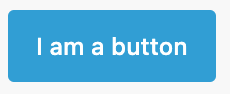
Basic
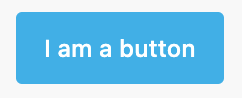
Text to display on the button is passed via slot.
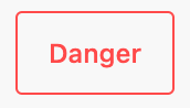
Disabled
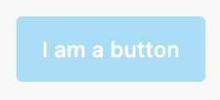
When disabled is present, the element cannot be edited and focused.
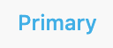
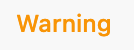
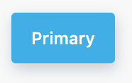
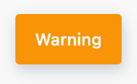
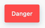
Variant
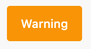
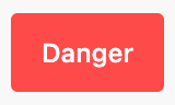
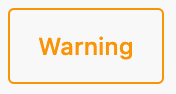
Variant defines the color of the button. It could be primary, warning, danger.
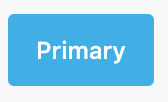
<vc-button variant="primary">Primary</vc-button>
<vc-button variant="warning">Warning</vc-button>
<vc-button variant="danger">Danger</vc-button>
Icons
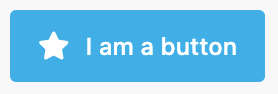
Icon of a button is specified with icon property and icon size is configured with iconSize property. Also you can use iconClass property to add custom class to icon.
Default iconSize is s.
Small
Button provides small size as alternative to the standard.
Outline
Outlined buttons display a border without a background initially.

<vc-button variant="primary" outline>Primary</vc-button>
<vc-button variant="warning" outline>Warning</vc-button>
<vc-button variant="danger" outline>Danger</vc-button>
Selected
Selected button state is used to indicate that the button is selected.
Text
Text buttons are displayed as textual elements. They don't have background and border.
<vc-button variant="primary" text>Primary</vc-button>
<vc-button variant="warning" text>Warning</vc-button>
<vc-button variant="danger" text>Danger</vc-button>
Raised
Raised buttons display a shadow to indicate elevation.
<vc-button variant="primary" raised>Primary</vc-button>
<vc-button variant="warning" raised>Warning</vc-button>
<vc-button variant="danger" raised>Danger</vc-button>
Usage
Integrate the vc-button component seamlessly into your Vue applications based on your project's requirements.
Button API
API empowers you to create dynamic and interactive button components to customize its appearance and behavior.
Basic Vue
You can easily incorporate the vc-button component into your Vue applications using simple templates.
Props
To customize the behavior and the appearance of the vc-button component, use the following props:
| Name and Type | Description |
|---|---|
variant {string} |
Variant defines the color of the button. It could be primary, danger, warning. |
icon {string} |
Icon of a button. Uses AwesomeIcons package. |
iconSize {string} |
Icon size. Could be xs, s, m, l, xl, xxl, xxxl. Default is s. |
small {boolean} |
Makes button small sized. |
outline {boolean} |
Outlined buttons display a border without a background initially. |
text {boolean} |
Text buttons are displayed as textual elements. They don't have background and border. |
raised {boolean} |
Raised buttons display a shadow to indicate elevation. |
selected {boolean} |
Selected button state is used to indicate that the button is selected. |
disabled {boolean} |
When disabled is present, the element cannot be edited and focused. |
iconClass {string} |
Custom class for icon. |
Slots
To enhance the content of the vc-button component, use the slot system:
| Name | Description |
|---|---|
default |
Button inner text. |
Emits
To interact with the vc-button component, use the emitted events. The click event, triggered when the button is clicked, allows you to implement dynamic behaviors and responses within your application:
| Name | Parameters | ReturnType | Description |
|---|---|---|---|
click |
value: Event |
void |
Emitted when button is clicked. |
Dynamic Views
To dynamically integrate the vc-button component into your views, use the schema interface:
interface ButtonSchema {
    id: string;
    component: "vc-button";
    content: string;
    small?: boolean;
    icon?: string;
    iconSize?: "xs" | "s" | "m" | "l" | "xl" | "xxl" | "xxxl";
    text?: boolean;
    method?: string;
    disabled?: {
        method: string;
    };
    visibility?: {
        method: string;
    };
    horizontalSeparator?: boolean;
}
To incorporate the button into your dynamic applications, define the following properties:
| Property and Type | Description |
|---|---|
id {string} |
The unique Id for the vc-button component. |
component {vc-button} |
Component used in schema. |
content {string} |
Button inner text. You can specify the localization key for the content. Under the hood, vue-i18n is used. |
small {boolean} |
Makes button small sized. |
icon {string} |
Button icon. Uses AwesomeIcons package. |
iconSize {string} |
Size of the button icon. |
text {string} |
Button as text without overlay. |
method {string} |
Method to be called when the button is clicked. Method should be defined in the blade scope. |
disabled {{method: string}} |
Disabled state for component, could be used to disable button based on some conditions. Method or variable should be defined in the blade scope and should return a boolean value. |
visibility {{method: string}} |
Visibility state for component, could be used to hide button based on some conditions. Method or variable should be defined in the blade scope and should return a boolean value. |
horizontalSeparator {boolean} |
Adds a horizontal separator line after the component. |