Select
Select is used to choose an item from a collection of options. It supports the combination of a method for loading options directly from the server with automatic loading of items on scrolling.
Usage
Include the vc-input-currency component in your Vue application, providing theming and enhanced functionality to your currency input.
Create a basic component as follows:
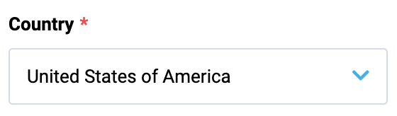
To start using all the available select properties, specify the vc-select component when creating the schema. For example:
{
    id: "selectId",
    component: "vc-select",
    label: "Country",
    property: "selectProperty",
    placeholder: "Select placeholder",
    optionsMethod: "fetchMethod",
    optionValue: "value",
    optionLabel: "label",
}
Where optionProperty is an object array containing select options, optionValue is the name of the property that contains the value of the option, optionLabel is the name of the property that contains the label of the option.
Select API
API empowers you to create a dynamic and interactive component to customize its appearance and behavior.
Basic Vue
You can easily incorporate the vc-select component into your Vue applications using simple templates.
Props
To customize the appearance and behavior of your component, use the following props:
| Property and Type | Description |
|---|---|
name {string} |
Name of select. |
modelValue {any} |
Model of the component; Must be Array if using 'multiple' prop. Use this property with a listener for 'update:modelValue' event OR use v-model directive. |
mapOptions {boolean} |
Try to map labels of model from 'options' Array. If you are using emit-value you will probably need to use map-options to display the label text in the select field rather than the value. Default value: true. |
error {boolean} |
Shows, if the field has validation errors. |
errorMessage {string} |
Validation error message (gets displayed only if 'error' is set to 'true'). |
label {string} |
Select label. |
hint {string} |
Select description (hint) text below input component. |
prefix {string} |
Prefix. |
suffix {string} |
Suffix. |
loading {boolean} |
Signals the user a process is in progress by displaying a spinner. |
clearable {boolean} |
Appends clearable icon when a value is set; When clicked, model becomes null. |
disabled {boolean} |
Put component in disabled mode. |
multiple {boolean} |
Allow multiple selection. Model must be Array. |
options {((keyword?: string, skip?: number, ids?: string[]) => Promise) }, {T[]} |
Available options that the user can select from. Default value: [] |
optionValue {OptionProp} |
Property of option which holds the 'value'. Default value: id. |
optionLabel {OptionProp} |
Property of option which holds the 'label'. Default value: title. |
emitValue {boolean} |
Update model with the value of the selected option instead of the whole option |
debounce {number}, {string} |
Debounce the search input update with an amount of milliseconds. Default value: 500. |
placeholder {string} |
Input placeholder text. |
tooltip {string} |
Input tooltip information. |
required {boolean} |
Input required state. |
searchable {boolean} |
Input search activation. |
multilanguage {boolean} |
Multilanguage support. |
currentLanguage {string} |
Current language. |
Slots
To enhance the content of the vc-select component, use the slot system:
| Name | Parameters | Description |
|---|---|---|
control |
scope: | Custom select control |
prepend-inner |
void | Prepend inner field |
append-inner |
void | Append to inner field |
prepend |
void | Prepend outer field |
append |
void | Append outer field |
no-option |
void | What should the menu display after filtering options and none are left to be displayed |
error |
void | Slot for errors |
hint |
void | Slot for hint text |
selected-item |
scope: | Override default selection slot |
option |
scope: | Override default selection slot |
no-options |
void | Slot for when there are no options available |
Emits
To effectively interact with the component, use the emitted events. The update:modelValue event is triggered with inputValue as a parameter and is emitted when the component needs to change the model. The search event is triggered when the user intends to filter a value and is emitted with inputValue as a parameter. The close event is emitted when the select options list is hidden.
| Event | Parameters | Description |
|---|---|---|
update:modelValue |
inputValue: MaybeArray<string \| Option> \| null |
Emitted when the component needs to change the model. Is is also used by v-model. |
search |
inputValue: string |
Emitted when user wants to filter a value |
close |
- | Emitted when the select options list is hidden |
Dynamic Views
To dynamically integrate the vc-select component into your views, use the schema interface:
interface SelectSchema {
    id: string;
    component: "vc-select";
    label?: string;
    property: string;
    rules?: IValidationRules;
    placeholder?: string;
    tooltip?: string;
    optionsMethod: string;
    optionValue?: string;
    optionLabel?: string;
    searchable?: boolean;
    clearable?: boolean;
    emitValue?: boolean;
    customTemplate?: {
        component: string;
    };
    disabled?: {
        method: string;
    };
    visibility?: {
        method: string;
    };
    update?: {
        method: string;
    };
    horizontalSeparator?: boolean;
}
To incorporate the component into your dynamic applications, define the following properties:
| Property and Type | Description |
|---|---|
id {string} |
The unique Id for the vc-select component. |
component {vc-select} |
Component used in schema. |
label {string} |
Label for the select. Also available interpolation {} syntax based on current element context. You can specify the localization key for the label. Under the hood, vue-i18n is used. |
property {string} |
Property name that is used for binding select value to blade data. Supports deep nested properties like property[1].myProperty. Additionally, you have the flexibility to bind computed property that returns a value. Computed property should be defined in the blade scope. |
rules {IValidationRules} |
Validation rules for the select. Uses VeeValidate validation rules. |
placeholder {string} |
Placeholder text for the select. You can specify the localization key for the placeholder. Under the hood, vue-i18n is used. |
tooltip {string} |
Tooltip text for the select label. You can specify the localization key for the tooltip. Under the hood, vue-i18n is used. |
optionsMethod {string} |
Method to call to get select options. Method should be defined in the scope blade. |
optionValue {string} |
Property that holds the value of the option. Default: id |
optionLabel {string} |
Property that holds the label of the option. Default: title |
searchable {boolean} |
Specification whether the select is searchable. |
clearable {boolean} |
Specification whether the select has a clear button. |
emitValue {boolean} |
Update model with the value of the selected option instead of the whole option. If true - emits only selected value, if false - emits whole selected object. |
customTemplate |
{component: string} |
disabled {{method: string}} |
Disabled state for component, could be used to disable select based on some conditions. Method or variable should be defined in the scope blade and should return a boolean value. |
visibility {{method: string}} |
Visibility state for component, could be used to hide select based on some conditions. Method or variable should be defined in the scope blade and should return a boolean value. |
update {{method: string}} |
Method to call when the select value is updated. It gets changed value, schema property name and field internal context as arguments. Method should be defined in the scope blade. |
horizontalSeparator {boolean} |
Adds a horizontal separator line after the component. |