Multivalue
Multivalue is a control that allows you to select multiple values from a list of values. Also supports the ability to add new values.
Usage
Include the vc-multivalue component in your Vue application.
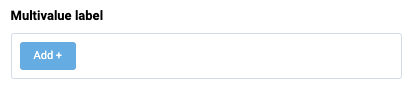
Create a basic multivalue as follows:
Multivalue API
API empowers you to create dynamic and interactive multivalue component to customize its appearance and behavior.
Basic Vue
You can easily incorporate the vc-multivalue component into your Vue applications using simple templates.
Props
To customize the appearance and behavior of your multivalue, use the following props:
| Property and Type | Description |
|---|---|
placeholder {string} |
Multivalue placeholder text. |
modelValue {T[]} |
Model of the component. |
required {boolean} |
Multivalue required state. |
disabled {boolean} |
Put component in disabled mode. |
type {text}, {number} |
Multivalue type. |
label {string} |
Multivalue label text. |
tooltip {string} |
Multivalue tooltip information. |
name {string} |
Used to specify the name of the control. |
options {T[]} |
Multivalue options list |
optionValue {string} |
Property of option which holds the 'value'. Default value: id. |
optionLabel {string} |
Property of option which holds the 'label'. Default value: title. |
multivalue {boolean} |
Ability to add values with Add button. |
error {boolean} |
Shows, if the field has validation errors. |
errorMessage {string} |
Validation error message (gets displayed only if 'error' is set to 'true'). |
multilanguage {boolean} |
Multilanguage support. |
currentLanguage {string} |
Current language. |
Slots
To enhance the content of the vc-multivalue component, use the slot system:
| Name | Type | Description |
|---|---|---|
item |
args: | Override item slot |
error |
void | Slot for errors |
Emits
To interact with the vc-multivalue component, use the emitted events. The update:modelValue event is triggered when the value of the component changes:
| Name | Parameters | ReturnType | Description |
|---|---|---|---|
update:modelValue |
value: T[] \| undefined |
Emitted when the value of the component changes. | |
close |
- | Emitted when the multivalue is closed. | |
search |
value: string |
Emitted when the search value of the component changes. |
Dynamic Views
To dynamically integrate the vc-multivalue component into your views, use the schema interface:
interface MultivalueSchema {
    id: string;
    component: "vc-multivalue";
    label?: string;
    tooltip?: string;
    property: string;
    placeholder?: string;
    required?: boolean;
    disabled?: boolean;
    variant?: "text" | "number";
    rules?: IValidationRules;
    options?: string;
    optionValue?: string;
    optionLabel?: string;
    multivalue?: boolean;
    error?: boolean;
    errorMessage?: string;
    multilanguage?: boolean;
    currentLanguage?: string;
    visibility?: {
        method: string;
    };
    customTemplate?: {
        component: string;
    };
    horizontalSeparator?: boolean;
}
To incorporate the multivalue into your dynamic applications, define the following properties:
| Property and Type | Description |
|---|---|
id {string} |
The unique Id for the vc-multivalue component. |
component {vc-multivalue} |
The vc-multivalue component. |
label? {string} |
Multivalue label text. You can specify the localization key for the label. Under the hood, vue-i18n is used. |
tooltip? {string} |
Multivalue tooltip information. You can specify the localization key for the tooltip. Under the hood, vue-i18n is used. |
property {string} |
The property of the model that the component is bound to. Additionally, you have the flexibility to bind computed property that returns a value. Computed property should be defined in the blade scope. |
placeholder? {string} |
Multivalue placeholder text. You can specify the localization key for the placeholder. Under the hood, vue-i18n is used. |
required? {boolean} |
Multivalue required state. |
disabled? {boolean} |
Put component in disabled mode. |
variant? {text}, {number} |
Multivalue type. |
rules {IValidationRules} |
Validation rules for the multivalue. Uses VeeValidate validation rules. |
options? {string} |
Method to get multivalue options array. Method should be defined in the scope blade. |
optionValue? {string} |
Property of option which holds the 'value'. Default value: id. |
optionLabel? {string} |
Property of option which holds the 'label'. Default value: title. |
multivalue? {boolean} |
Ability to add values with Add button. |
error? {boolean} |
Shows, if the field has validation errors. |
errorMessage? {string} |
Validation error message (gets displayed only if 'error' is set to 'true'). |
multilanguage? {boolean} |
Multilanguage support. |
currentLanguage? {string} |
Current language. |
visibility? {{ method: string }} |
Visibility settings. |
customTemplate? {{ component: string }} |
Custom template settings. |
horizontalSeparator {boolean} |
Adds a horizontal separator line after the component. |