Fieldset
Fieldset allows displaying sets of any available controls of any nested depth. It allows arranging elements in a grid with a customizable number of columns and aspect ratio that allows to control columns width, the ability to build a grid with multiple rows based on an array of data bound to the fieldset using the property option. It also has visibility state settings and ability to remove elements from the fieldset.
Usage
Include the vc-fieldset component in your Vue application, providing theming and enhanced functionality to your image inputs.
To start using all the available fieldset properties, specify the vc-fieldset component when creating the schema. For example:
As fieldset has the ability of deep nesting, you can add other fieldsets or controls to it and create complex UI interfaces.
Dynamic Views
To dynamically integrate the vc-fieldset component into your views, use the schema interface:
interface FieldsetSchema {
    id: string;
    component: "vc-fieldset";
    fields: ControlSchema[];
    columns?: number;
    property?: string;
    aspectRatio?: number[];
    remove?: {
        method: string;
    };
    visibility?: {
        method: string;
    };
    horizontalSeparator?: boolean;
}
To incorporate the component into your dynamic applications, define the following properties:
| Property and Type | Description |
|---|---|
id {string} |
The unique Id for the fieldset. |
component {vc-fieldset} |
Component used in schema. |
fields {ControlSchema[]} |
Array of control schemas to be displayed in the fieldset. |
columns {number} |
Number of columns to display the fields in. |
property {string} |
Property name that is used for binding fieldset value to blade data. Supports deep nested properties like property[1].myProperty. Additionally, you have the flexibility to bind computed property that returns a value. Computed property should be defined in the blade scope. |
aspectRatio {number[]} |
Array of numbers that define the aspect ratio of each column. Uses CSS flex-grow property. Example: set to [1, 1] to make all columns equal width |
remove {{method: string}} |
Method to call to remove field from the fieldset. When set - activates remove button. Used for property-based fieldsets. Method should be defined in the blade scope. |
visibility {{method: string}} |
Visibility state for component, could be used to hide fieldset based on some conditions. Method or variable should be defined in the blade scope and should return a boolean value. |
horizontalSeparator {boolean} |
Adds a horizontal separator line after the component. |
Examples
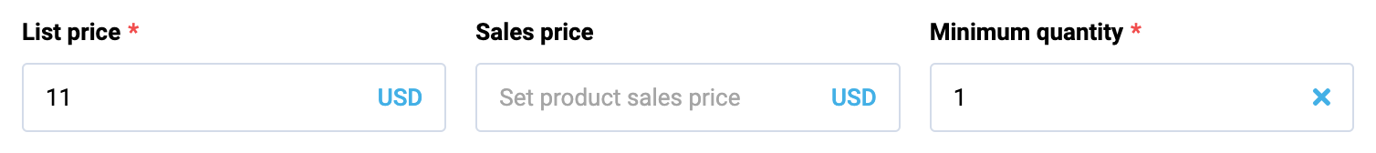
Fieldset allows you to create different display options for controls. For example, you can create a fieldset with two columns, each of which will have two inputs. To do so, create a fieldset with two inputs and specify the value 2 in the columns parameter. You can also specify the aspectRatio parameter and set the aspect ratio of the column width. For example, if you specify [1, 1], the columns will be the same width. If you specify [1, 2], the second column will be twice as wide as the first.
Let's look at a few examples of use cases.
Regular fieldset with two fields in one column
{
        id: "fieldsetId",
        component: "vc-fieldset",
        fields: [
            {
                id: "input1",
                component: "vc-input",
                label: "Input 1",
                property: "input1",
            },
            {
                id: "input2",
                component: "vc-input",
                label: "Input 2",
                property: "input2",
            },
        ],
}
Regular fieldset with two fields in two columns
{
        id: "fieldsetId",
        component: "vc-fieldset",
        columns: 2,
        fields: [
            {
                id: "input1",
                component: "vc-input",
                label: "Input 1",
                property: "input1",
            },
            {
                id: "input2",
                component: "vc-input",
                label: "Input 2",
                property: "input2",
            },
        ],
}
Building a fieldset from an array of data
Use the property parameter. In this case, each element of the array will be displayed in a separate fieldset. Also, if we want to add a delete button, we can specify a method that will be called when the delete button is clicked. In this method, we can remove an element from the data array that we specified in the property parameter.
{
        id: "fieldsetId",
        component: "vc-fieldset",
        property: "fieldsetProperty",
        remove: {
            method: "removeFieldsetElement",
        },
        fields: [
            {
                id: "input1",
                component: "vc-input",
                label: "Input 1",
                property: "input1",
            },
            {
                id: "input2",
                component: "vc-input",
                label: "Input 2",
                property: "input2",
            },
        ],
}
If we want each field to have a label that is not manually set, but obtained when building from an array, we can use interpolation.
For example, if we want each field to have a label that we get from an object in the array, we can specify the following in the label parameter: label: "{label}". In this case, when building the fieldset, each field will be set a label that will be obtained from the data array.
Let's consider this on the example of a small data array located in fieldsetProperty:
Now let's specify the following fieldset:
{
    id: "fieldsetId",
    component: "vc-fieldset",
    property: "fieldsetProperty",
    fields: [
        {
            id: "input1",
            component: "vc-input",
            label: "{label}",
            property: "value",
        },
    ],
}
Now each field will be set a label that will be obtained from the data array.
Customizing fieldset layout
We can specify the number of columns and aspectRatio for the fieldset, which will be displayed inside the fieldset. In this case, we will get a fieldset with two columns, each of which will have a fieldset with two fields and second fieldset will be twice as wide as the first.
{
        id: "fieldsetId",
        component: "vc-fieldset",
        columns: 2,
        aspectRatio: [1, 2],
        fields: [
            {
                id: "fieldsetId",
                component: "vc-fieldset",
                fields: [
                    {
                        id: "input1",
                        component: "vc-input",
                        label: "Input 1",
                        property: "input1",
                    },
                    {
                        id: "input2",
                        component: "vc-input",
                        label: "Input 2",
                        property: "input2",
                    },
                ],
            },
        ],
}