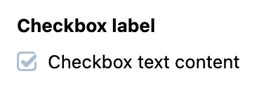
Checkbox
Checkbox is an extension to a standard checkbox element with theming.
Usage
Include the vc-checkbox component in your Vue application, providing theming and enhanced functionality to your checkbox inputs.

Create a basic checkbox as follows:
Checkbox API
API empowers you to create dynamic and interactive checkbox components to customize its appearance and behavior.
Basic Vue
You can easily incorporate the vc-checkbox component into your Vue applications using simple templates.
Props
To customize the appearance and behavior of checkboxes, use the following props:
| Property and Type | Description |
|---|---|
modelValue {MaybeRef<boolean>} |
The value of the component. |
disabled {boolean} |
Disabled state for the component. |
required {boolean} |
Indicates if the component is required. |
name {string} |
The name attribute of the component. |
errorMessage {string} |
The error message to display when validation fails. |
trueValue {boolean} |
Set value for checked state. Default: true |
falseValue {boolean} |
Set value for unchecked state. Default: false |
label {string} |
The label of the component. |
tooltip {string} |
The tooltip text to display when hovering over the component. |
Slots
To enhance the content of the vc-checkbox component, use the slot system:
| Name | Description |
|---|---|
default |
Checkbox text content slot. |
error |
Slot for error message |
Emits
To interact with the vc-checkbox component, use the emitted events. The update:modelValue event is triggered when the value of the component changes:
| Name | Parameters | ReturnType | Description |
|---|---|---|---|
update:modelValue |
value: boolean |
void |
Emitted when the value of the component changes. |
Dynamic Views
To dynamically integrate the vc-checkbox component into your views, use the schema interface:
interface CheckboxSchema {
    id: string;
    component: "vc-checkbox";
    trueValue?: boolean;
    falseValue?: boolean;
    label?: string;
    rules?: IValidationRules;
    tooltip?: string;
    property: string;
    content?: string;
    update?: {
        method: string
    };
    disabled?: {
        method: string;
    };
    visibility?: {
        method: string;
    };
    horizontalSeparator?: boolean;
}
To incorporate the checkbox into your dynamic applications, define the following properties:
| Property | Description |
|---|---|
id {string} |
The unique Id for vc-checkbox component. |
component {string} |
vc-checkbox |
trueValue {boolean} |
Set value for checked state. |
falseValue {boolean} |
Set value for unchecked state. |
label {string} |
Checkbox label that is displayed above the checkbox. Also available interpolation {} syntax based on current element context. You can specify the localization key for the label. Under the hood, vue-i18n is used. |
rules {IValidationRules} |
Checkbox validation rules. Could be used to validate checkbox value. Uses VeeValidate validation rules. |
tooltip {string} |
Checkbox tooltip that is displayed when hovering over the checkbox label tooltip icon. You can specify the localization key for the tooltip. Under the hood, vue-i18n is used. |
property {string} |
Property name that is used for binding checkbox value to blade data. Supports deep nested properties like property[1].myProperty. Additionally, you have the flexibility to bind computed property that returns a value. Computed property should be defined in the blade scope. |
content {string} |
Text content that is displayed on the right side of the checkbox. You can specify the localization key for the content. Under the hood, vue-i18n is used. |
update {{method: string}} |
Update method that is called when checkbox value is changed. It gets changed value, schema property name and field internal context as arguments. Method should be defined in the blade scope. |
disabled {{method: string}} |
Disabled state for component, could be used to disable checkbox based on some conditions. Method or variable should be defined in the blade scope and should return a boolean value. |
visibility {{method: string}} |
Visibility state for component, could be used to hide checkbox based on some conditions. Method or variable should be defined in the blade scope and should return a boolean value. |
horizontalSeparator {boolean} |
Adds a horizontal separator line after the component. |