Overview
This type of view enables the creation of blades containing a tabular list. The view includes the following features:
- Built-in pagination.
- Filters.
- Multiselect.
- Reorderable rows.
- Search field.
- Ability to create a custom mobile view template.
- Ability to create a custom empty list template.
- Ability to create a custom not-found list template.
Usage sample
import { DynamicGridSchema } from "@vc-shell/framework";

export const grid: DynamicGridSchema = {
    settings: {
        url: "/dynamic-module-list",
        id: "DynamicItems",
        titleTemplate: "Dynamic module blade",
        localizationPrefix: "DynamicModule",
        isWorkspace: true,
        composable: "useList",
        component: "DynamicBladeList",
        toolbar: [
        {
            id: "refresh",
            icon: "fas fa-sync-alt",
            title: "Refresh",
            method: "refresh",
        },
        ],
        menuItem: {
            title: 'DYNAMICMODULE.MENU.TITLE',
            icon: "fas fa-file-alt",
            priority: 1,
        }
    },
    content: [
        {
        id: "itemsGrid",
        component: "vc-table",
        mobileTemplate: {
            component: "DynamicItemsMobileGridView",
        },
        multiselect: true,
        columns: [
            {
                id: "imgSrc",
                title: "Pic",
                type: "image",
                alwaysVisible: true,
            },
            {
                id: "name",
                title: "Name",
                alwaysVisible: true,
            },
            {
                id: "createdDate",
                title: "Created date",
                sortable: true,
                type: "date-ago",
            },
        ],
        },
    ],
};
View programming structure
View declaration
To create a view, create a schema and pass it to the dynamic view. The schema must contain the following properties - settings and content:
| Property | Type | Description |
|---|---|---|
settings |
SettingsGrid |
The settings of the view. |
content |
ListContentSchema[] |
The content of the view. |
Schema Settings API
SettingsGrid is an extension of SettingsBase with additional settings for DynamicBladeList:
Every newly created view must have settings that describe its behavior and appearance. Depending on the type of view used, the settings may vary slightly. The settings are represented by an object built using the following SettingsBase interface:
interface SettingsBase {
    url?: string;
    localizationPrefix: string;
    id: string;
    titleTemplate: string;
    composable: string;
    toolbar: {
        id: string;
        title: string;
        icon: string;
        method: string;
    }[];
    component: "DynamicBladeList";
    permissions?: string | string[];
    pushNotificationType?: string | string[];
    isWorkspace?: boolean;
    menuItem?: {
        id?: string;
        title: string;
        icon: string;
        group?: string;
        priority: number;
        inGroupPriority?: number;
    };
    width?: `${number}%`;
}
| Property | Type | Description |
|---|---|---|
url |
string |
The URL of the view. This option is required if you want to add the view to the navigation menu or want to access it directly by URL. If you do not specify a URL, the view will be available only as a child view of another view. |
id |
string |
The unique ID of the view. This option is required. The ID is used to identify the view in the navigation system and provides scheme overriding capabilities. |
localizationPrefix |
string |
The prefix used for localization keys. This option is required. The prefix is used to provide localized content for the view. For example, if you specify the prefix MyList, the localization key for the title of the view will be MyList.Title. Under the hood, vue-i18n is used. |
titleTemplate |
string |
The title of the view that is shown in the blade header by default. This option is required. |
component |
"DynamicBladeForm" | "DynamicBladeList" |
The name of the Vue component used by the view. This option is required. It could be one of the following values: - DynamicBladeList - DynamicBladeForm |
composable |
string |
The name of the composable used by the view. This option is required. |
isWorkspace |
boolean |
Indication whether the view is a workspace. This option is used to determine which view should be the default view. Default: false |
toolbar |
object[] |
An array of objects representing the toolbar buttons. This option is optional. If you do not specify any buttons, the toolbar will not be displayed. Each object in the array must have the following properties: id, title, icon, and method. More info about toolbar creation can be found in the Toolbar section. |
permissions |
string, string[] |
The permissions required to access the view. This option is optional. If you do not specify any permissions, the view will be available to all users. |
pushNotificationType |
string, string[] |
The push notification types associated with the view. This option is optional. If you do not specify any push notification types, the view will not receive any push notifications. |
menuItem |
{ id?: string; title: string; icon: string; group?: string; priority: number; inGroupPriority?: number; } |
The settings for the navigation menu item. This option is optional. If you do not specify the menuItem object, the view will not be added to the navigation menu. More info about menu item creation can be found in the Navigation/Creating Navigation Menu Items section. |
width |
${number}% |
The width of the collapsed blade. This option is optional. If you do not specify the width, the view will be displayed in 50% width. |
Schema Content API
ListContentSchema
ListContentSchema is an interface that contains settings for the tabular list:
interface ListContentSchema {
  id: string;
  component: "vc-table";
  filter?: FilterSchema;
  multiselect?: boolean;
  header?: boolean;
  columns?: (ITableColumns & {
    id: string;
    title: string;
    sortable?: boolean;
    alwaysVisible?: boolean;
    type?: string;
    customTemplate?: GridTemplateOverride;
  })[];
  reorderableRows?: boolean;
  mobileTemplate?: {
    component: string;
  };
  notFoundTemplate?: {
    component: string;
  };
  emptyTemplate?: {
    component: string;
  };
}
| Property | Type | Description |
|---|---|---|
id |
string |
The unique ID of the view. |
component |
"vc-table" |
The name of the Vue component used by the view. |
filter |
FilterSchema |
The filter settings. |
multiselect |
boolean |
Indication whether multiselect is enabled. |
header |
boolean |
Indication whether the header of vc-table is enabled. When true - enables the search bar and provides the possibility to use Filter. |
columns |
(ITableColumns & { id: string; title: string; sortable?: boolean; alwaysVisible?: boolean; type?: string; customTemplate?: GridTemplateOverride; })[] |
The columns settings. |
reorderableRows |
boolean |
Indication whether reorderable rows are enabled. |
mobileTemplate |
{ component: string; } |
The mobile template settings. The component must be registered globally. |
notFoundTemplate |
{ component: string; } |
The not found template settings. The component must be registered globally. |
emptyTemplate |
{ component: string; } |
The empty template settings. The component must be registered globally. |
FilterSchema
FilterSchema is an interface that contains settings for filters:
type FilterSchema = {
    columns: {
    title: string;
    id: string;
    controls: (FilterCheckbox | FilterDateInput)[];
  }[];
}
At the moment, two types of filters are supported: FilterCheckbox and FilterDateInput. Learn more about them in the instructions below.
FilterCheckbox
FilterCheckbox is an interface that contains settings for checkbox filters:
type FilterCheckbox = {
  id: string;
  field: string;
  multiple?: boolean;
  data: string;
  optionValue: string;
  optionLabel: string;
  component: "vc-checkbox";
};
Since filters represent columns with their own title and controls, they can be multiple. Let's look at the settings for the FilterCheckbox control:
| Property | Type | Description |
|---|---|---|
field |
string |
Name of the property that we want to pass for filtering |
component |
"vc-checkbox" |
Component used in the schema |
data |
string |
Name of the computed property from scope object, that returns array of filter data. |
multiple |
boolean |
Indication whether multiple values can be selected. Default: true |
optionValue |
string |
The name of the property that will be used as a value for the checkbox. |
optionLabel |
string |
The name of the property that will be used as a label for the checkbox. |
Let's consider an example of using the FilterCheckbox filter. To do this, create a filter object in the vc-table component schema:
filter: {
    columns: [
        {
            id: "statusFilter",
            title: "Status filter",
            controls: [
                {
                    id: "statusCheckbox",
                    field: "status",
                    component: "vc-checkbox",
                    data: 'filterData',
                    optionValue: "value",
                    optionLabel: "label",
                },
            ],
        },
    ],
},
In next step you need to create a computed property filterData in the scope object of your blade. This property should return an array of objects with the specified optionValue and optionLabel properties. For example:
enum SellerProductStatus {
    None = "None",
    Published = "Published",
    HasStagedChanges = "HasStagedChanges",
    WaitForApproval = "WaitForApproval",
    RequiresChanges = "RequiresChanges",
    Rejected = "Rejected",
    Approved = "Approved"
}

const useList = (args: // ...): UseList => {
    const scope = ref<ListScope>({
        filterData: computed(() => {
            return Object.entries(SellerProductStatus).reduce(
                (acc, [value, displayValue]) => {
                    if (value.includes(SellerProductStatus.Approved)) return acc;

                    acc.push({
                        value,
                        displayValue,
                    });

                    return acc;
                },
                [] as Record<string, string>[],
            );
        }),
    });

    return {
        // ...,
        scope: computed(() => scope.value),
    }
}
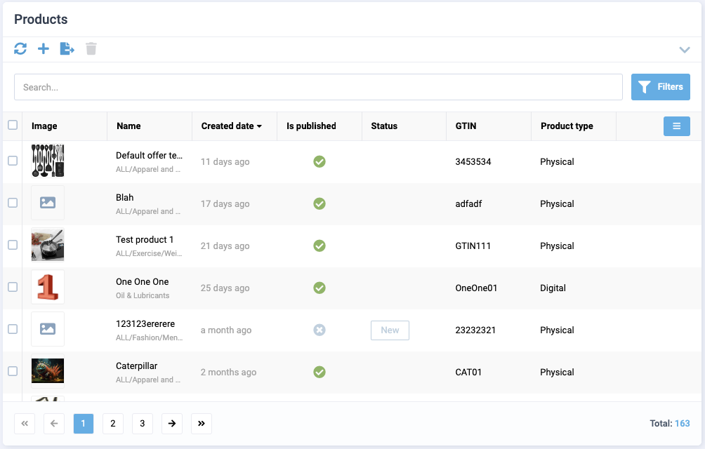
As a result, you will get the following result:
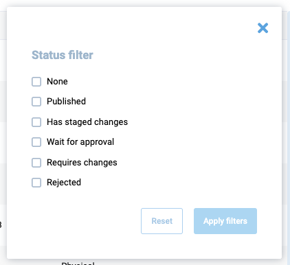
When one or more values of the filter are selected, their value will be recorded in the status field, which will be passed to the query when requesting data.
FilterDateInput
FilterDateInput is an interface that contains settings for date input filters:
Since filters represent columns with their own title and controls, they can be multiple. Let's look at the settings for the FilterDateInput control:
| Property | Type | Description |
|---|---|---|
field |
string |
Name of the property that we want to pass for filtering |
component |
"vc-input" |
Component used in the schema |
label |
string |
Text that will be displayed as input label. |
Let's consider an example of using the FilterDateInput filter. To do this, create a filter object in the vc-table component schema:
filter: {
    columns: [
        {
            id: "orderDateFilter",
            title: "orderDate",
            controls: [
                {
                    id: "startDateInput",
                    field: "startDate",
                    label: "Start date",
                    component: "vc-input",
                },
                {
                    id: "endDateInput",
                    field: "endDate",
                    label: "End date",
                    component: "vc-input",
                },
            ],
        },
    ],
},
As a result, you will get the following result:
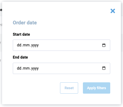
When one or more date values of the filter are selected, their values will be recorded in the startDate and endDate fields, respectively. These values will be passed to the query when requesting data.
Create composable for DynamicBladeList
To create a composable for DynamicBladeList, use the built-in composable factory function named useListFactory. This factory returns a composable method that provides you with all the necessary methods and properties to work with the list.
useListFactory API
The useListFactory function returns an object with the following properly typed properties:
| Property | Type | Description |
|---|---|---|
items |
ComputedRef<Items> |
The readonly list of items loaded after running load. |
query |
Ref<Query> |
The query object used to load data. |
loading |
Ref<boolean> |
Indicates whether the data is loading. |
pagination |
ComputedRef<Pagination> |
The pagination object containing currentPage, totalCount, pageSize, pages. |
load |
AsyncAction<Query> |
The method used to load data. |
remove |
AsyncAction<CustomQuery> |
The method used to remove data. |
This function accepts an object with load and remove callback methods to implement. The load method is used to load data for the list, and the remove method is used to remove data from the list.
Note
The load and remove methods must return a promise.
Implement composable from useListFactory
Let's create a file named useList.ts in the composables folder of your module and add the following code:
import { useListFactory, UseList } from "@vc-shell/framework";

const useList = (): UseList => {
    const factory = useListFactory({
        load: async (query) => {
            // return your load method here
        },
        remove: async (query, customQuery) => {
            // return your remove method here
        },
    });

    const { items, load, remove, loading, pagination, query } = factory();

    return {
        items,
        load,
        remove,
        loading,
        pagination,
        query,
    };
}
To implement the load and remove methods, use useApiClient composable from @vc-shell/framework package. This composable returns a getApiClient method, that provides you with an instance of the API client class, which you can use to make requests to your API.
Let's look at the example of using the useApiClient method with useListFactory in the useList composable:
import { useApiClient } from "@vc-shell/framework";
import { SomeClient } from "@your-api-package";

const { getApiClient } = useApiClient(SomeClient);

export const useList = (): UseList => {
    const factory = useListFactory({
        load: async (query) => {
            return (await getApiClient()).someSearchFn(query);
        },
        remove: async (query, customQuery) => {
            return (await getApiClient()).someRemoveFn(query);
        },
    });
}
Note
These callback methods have arguments: query in load and query, customQuery in remove. These arguments are used to pass the query parameters to your API client. useListFactory also returns a query property, which contains the query parameters passed to the methods.
With the use of useListFactory, you get a ready-to-use composable, which already has all the necessary methods and properties to work with the list. All you need to do is just to implement the load and remove methods. Also you can add your own logic, methods and properties to the composable, as in other composable functions.
Since the useListFactory method is generic, you can provide your own types for your loaded items and query from your API client. Lets look at an example based on Offers module from vc-app:
UseList interface is also a generic type that accepts your loaded Items, Query and your scope types:
This allows you to get proper typing of your composable and data.
Access to Blade Component Props and Events
All composables created for dynamic views have incoming parameters by default, which are passed from the dynamic views component:
| Name | Description |
|---|---|
props |
Contains all blade parameters. |
emit |
Includes all blade events that it can emit. |
mounted |
Returns true if the dynamic views component has been mounted; otherwise, it returns false. |
To obtain types, import DynamicBladeList as follows:
import { Ref } from "vue";
import { DynamicBladeList } from "@vc-shell/framework";

const useList = (args: {
    props: InstanceType<typeof DynamicBladeList>["$props"];
    emit: InstanceType<typeof DynamicBladeList>["$emit"];
    mounted: Ref<boolean>;
}) => {
    // your composable code here
}
Thanks to this, you always have access to all incoming blade parameters and can use events emit directly from your composable.
Blade Scope
Each composable created for dynamic views can have a scope, a special variable containing all additional methods, computed values, reactive variables, toolbar overrides that you want to use in your blade.
To use scope, return it from your composable:
const useList = (args: // ...): UseList => {
    const scope = ref<ListScope>({
        // your scope here
    });

    return {
        // ...,
        scope: computed(() => scope.value),
    }
}
Create an interface, for example, ListScope, which should extend from the ListBaseBladeScope interface to provide type-check for the scope and should include all additional methods, computed values, reactive variables, toolbar overrides that you want to use in your blade, as follows:
import { ListBaseBladeScope } from "@vc-shell/framework";

interface ListScope extends ListBaseBladeScope {
    // scope types here
}
Note
The ListBaseBladeScope interface has an openDetailsBlade method to implement. This method is used to open the details blade for the selected item.
openDetailsBlade Method
To open the details blade for a selected item, implement the openDetailsBlade method and add it to your scope object. With the use of the openDetailsBlade method, you can pass additional options to the details blade.
The basic implementation looks like this:
const useList = (args: // ...): UseList => {
    const { openBlade, resolveBladeByName } = useBladeNavigation();

    async function openDetailsBlade(data?: Omit<Parameters<typeof openBlade>["0"], "blade">) {
        await openBlade({
            blade: resolveBladeByName("YourDetailsBladeName"),
            options: {
                // any options you want to pass to the details blade
            },
            ...data,
        });
  }

    const scope = ref<ListScope>({
        openDetailsBlade,
    });

    return {
        // ...,
        scope: computed(() => scope.value),
    }
}
The toolbarOverrides object
After you define toolbar object in schema, you can add some custom actions to it or change its visibility or disabled state. To do so, you can use toolbarOverrides object in your scope:
const useList = (args: // ...): UseList => {
    const scope = ref<ListScope>({
        // ...
        toolbarOverrides: {
            // your toolbar overrides here
        },
    });
}
Default toolbar buttons
DynamicBladeList has a built-in toolbar buttons, which you can use. All this toolbar button objects has methods, visibility and disabled state already implemented, so you just need to add in in your view schema. Also you can override this methods in toolbarOverrides object by its names.
This method names are: openAddBlade, refresh, removeItems, save
 Overriding default toolbar methods and properties
DynamicBladeList Blade Context
DynamicBladeList blade context is an object that contains all methods and properties, returned from composable and settings from view schema.