Input
Input is an extension of a standard input element.
Usage
Include the vc-input component in your Vue application, providing theming and enhanced functionality to your inputs.
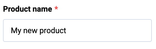
Create a basic input as follows:
Input API
API empowers you to create dynamic and interactive input component to customize its appearance and behavior.
Basic Vue
You can easily incorporate the vc-input component into your Vue applications using simple templates.
Props
To customize the appearance and behavior of your input, use the following props:
| Property and Type | Description |
|---|---|
modelValue {string}, {number}, {Date}, {null}, {undefined} |
Model of the component; Use with a listener for 'update:model-value' event OR use v-model directive. |
label {string} |
Input label text. |
placeholder {string} |
Input placeholder text. |
type {"text"}, {"password"}, {"email"}, {"tel"}, {"number"}, {"url"}, {"time"}, {"date"}, {"datetime-local"} |
Input type. Default value: text |
hint {string} |
Input description (hint) text below input component. |
clearable {boolean} |
Appends clearable icon when a value is set. When clicked, model becomes null. |
prefix {string} |
Prefix. |
suffix {string} |
Suffix. |
name {string} |
Used to specify the name of the control. If not specified, it takes the value 'Field'. |
loading {boolean} |
Signals the user a process is in progress by displaying a spinner |
debounce {string}, {number} |
Debounce amount (in milliseconds) when updating model |
disabled {boolean} |
Put component in disabled mode |
autofocus {boolean} |
Focus field on initial component render |
error {boolean} |
Shows, if the field has validation errors |
errorMessage {string} |
Validation error message (gets displayed only if 'error' is set to 'true') |
maxlength {string}, {number} |
Specify a max length of model. Default value: 1024 |
tooltip {string} |
Input tooltip information |
required {boolean} |
Input required state |
multilanguage {boolean} |
Input multilanguage state |
currentLanguage {string} |
Input current language |
Slots
To enhance the content of the vc-input component, use the slot system:
| Name | Type | Description |
|---|---|---|
control |
(scope: { editable: boolean \| undefined; focused: boolean \| undefined; modelValue: string \| number \| Date \| null; emitValue: (value: string \| number \| Date \| null) => void; placeholder: string \| undefined; }) => any |
Slot for controls |
prepend |
void | Prepend outer field |
prepend-inner |
void | Prepend inner field |
append-inner |
void | Append to inner field |
append |
void | Append outer field |
error |
void | Slot for errors |
hint |
void | Slot for hint text |
Emits
To interact with the vc-input component, use the emitted events. The update:modelValue event is triggered when the value of the component changes:
| Name | Parameters | ReturnType | Description |
|---|---|---|---|
update:modelValue |
value: string \| number \| Date \| null |
void |
Emitted when the value of the component changes. |
Dynamic Views
To dynamically integrate the vc-input component into your views, use the schema interface:
interface InputSchema {
    id: string;
    component: "vc-input";
    label?: string;
    property: string;
    rules?: IValidationRules;
    placeholder?: string;
    tooltip?: string;
    clearable?: boolean;
    variant?: "number" | "text" | "password" | "email" | "tel" | "url" | "time" | "date" | "datetime-local";
    disabled?: {
        method: string;
    };
    visibility?: {
        method: string;
    };
    update?: {
        method: string;
    };
    multilanguage?: boolean;
    prepend?: ControlSchema;
    prependInner?: ControlSchema;
    append?: ControlSchema;
    appendInner?: ControlSchema;
    horizontalSeparator?: boolean;
}
To incorporate the input into your dynamic applications, define the following properties:
| Property and Type | Description |
|---|---|
id {string} |
The unique Id for the vc-input component. |
component {vc-input} |
Component used in schema. |
label {string} |
Label for the input. Also available interpolation {} syntax based on current element context. You can specify the localization key for the label. Under the hood, vue-i18n is used. |
property {string} |
Property name that is used for binding input value to blade data. Supports deep nested properties like property[1].myProperty. Additionally, you have the flexibility to bind computed property that returns a value. Computed property should be defined in the blade scope. |
rules {IValidationRules} |
Validation rules for the input. Uses VeeValidate validation rules. |
placeholder {string} |
Placeholder text for the input. You can specify the localization key for the placeholder. Under the hood, vue-i18n is used. |
tooltip {string} |
Tooltip text for the input label. You can specify the localization key for the tooltip. Under the hood, vue-i18n is used. |
clearable {boolean} |
Specification whether the input has a clear button. |
variant {string} |
Input variant. |
disabled {{method: string}} |
Disabled state for component, could be used to disable input based on some conditions. Method or variable should be defined in the blade scope and should return a boolean value. |
visibility {{method: string}} |
Visibility state for component, could be used to hide input based on some conditions. Method or variable should be defined in the blade scope and should return a boolean value. |
update {{method: string}} |
Method to call when the input value is updated. It gets changed value, schema property name and field internal context as arguments. Method should be defined in the blade scope. |
prepend {ControlSchema} |
Schema of component to be displayed before the input. |
prependInner {ControlSchema} |
Schema of component to be displayed inside the input before the value. |
append {ControlSchema} |
Schema of component to be displayed after the input. |
appendInner {ControlSchema} |
Schema of component to be displayed inside the input after the value. |
horizontalSeparator {boolean} |
Adds a horizontal separator line after the component. |