Table
Table is a component that displays data in a tabular format. It is used to display large amounts of data in a structured format.
Usage
Include the vc-table component in your Vue application:
Create a basic table as follows:
Table API
API empowers you to create dynamic and interactive table components to customize its appearance and behavior.
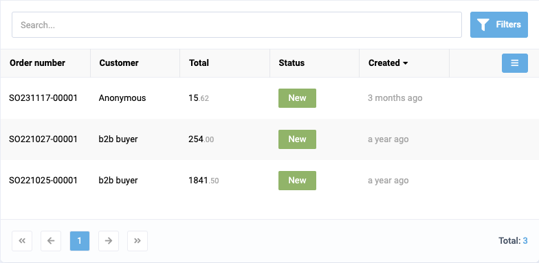
Basic Vue
You can easily incorporate the vc-table component into your Vue applications using simple templates.
Props
To customize the appearance and behavior of table, use the following props:
| Property and Type | Description |
|---|---|
columns {ITableColumns[]} |
Array of table columns. Required. |
items {T[]} |
Array of table items. Default: []. Required. |
itemActionBuilder {((item: T) => IActionBuilderResult[])} |
Function to build item actions. |
sort {string} |
Sort key for the table. |
multiselect {boolean} |
Enable multiselect for the table. |
expanded {boolean} |
Prop to pass from expanded blade prop. Default: true |
totalLabel {string} |
Label for the total count of items. |
totalCount {number} |
Total count of items. Default: 0 |
pages {number} |
Number of pages in the table. Default: 0 |
currentPage {number} |
Current page in the table. Default: 0 |
searchPlaceholder {string} |
Placeholder text for the search input. |
searchValue {string} |
Value of the search input. |
loading {MaybeRef |
Loading state of the table. |
empty {StatusImage} |
Image, text and action to display when the table is empty. |
notfound {StatusImage} |
Image, text and action to display when no items are found. |
header {boolean} |
Enable table header. Default: true |
footer {boolean} |
Enable table footer. Default: true |
activeFilterCount {number} |
Count of active filters. Default: 0 |
selectedItemId {string} |
ID of the selected item. |
pullToReload {boolean} |
Enable pull-to-reload functionality. |
resizableColumns {boolean} |
Enable resizable columns. Default: true |
reorderableColumns {boolean} |
Enable reorderable columns. Default: false |
reorderableRows {boolean} |
Enable reorderable rows. Default: false |
stateKey {string} |
Key to store the table state. Required. |
selectAll {boolean} |
Enable select all functionality. |
Emits
To interact with the vc-table component, use the emitted events.
| Name | Parameters | ReturnType | Description |
|---|---|---|---|
paginationClick |
page: number |
void |
Emitted when the pagination is clicked. |
selectionChanged |
values: T[] |
void |
Emitted when the selection is changed. |
search:change |
value: string \| number \| Date \| null \| undefined |
void |
Emitted when the search value changes. |
headerClick |
item: ITableColumns |
void |
Emitted when a table header is clicked. |
itemClick |
item: T |
void |
Emitted when a table item is clicked. |
scroll:ptr |
- | void |
Emitted when the table is scrolled to the pull-to-reload position. |
row:reorder |
args: { dragIndex: number; dropIndex: number; value: T[] } |
void |
Emitted when a table row is reordered. |
select:all |
values: boolean |
void |
Emitted when the select all functionality is triggered. |
Slots
To enhance the content of the vc-table component, use the slot system:
| Name | Type | Description |
|---|---|---|
header |
(props: any) => any |
Slot for header |
filters |
(args: { closePanel: () => void }) => any |
Slot for filters |
mobile-item |
(args: { item: T }) => any |
Slot for mobile item template |
header_${string} |
(props: any) => any |
Dynamic column header slot |
item_${string} |
(args: { item: T; cell: ITableColumns }) => any |
Dynamic column item slot |
notfound |
(props: any) => any |
Slot for not found |
empty |
(props: any) => any |
Slot for empty |
footer |
(props: any) => any |
Slot for footer |
Dynamic Views
To dynamically integrate the vc-table component into your views, use the schema interface:
interface TableSchema {
    id: string;
    component: "vc-table";
    property: string;
    multiselect?: boolean;
    header?: boolean;
    footer?: boolean;
    columns?: ITableColumns[];
    reorderableRows?: boolean;
    mobileTemplate?: {
        component: string;
    };
    notFoundTemplate?: {
        component: string;
    };
    emptyTemplate?: {
        component: string;
    };
    visibility?: {
        method: string;
    };
}

interface ITableColumns {
    id: string;
    width?: number | string;
    field?: string;
    alwaysVisible?: boolean;
    type?: "money" | "date-ago" | "date" | "time" | "date-time" | "image" | "status" | "status-icon" | "number" | "link";
    sortable?: boolean;
    class?: string;
    format?: string;
    align?: "start" | "end" | "center" | "between" | "around" | "evenly";
    title: string;
    sortable?: boolean;
    type?: string;
    customTemplate?: GridTemplateOverride;
    visible?:
        | boolean
        | { method: string; };
}
To incorporate the table into your dynamic applications, define the following properties:
| Property | Description |
|---|---|
id {string} |
The unique Id for vc-table component. |
component {string} |
vc-table |
property {string} |
Property name that is used for binding table value to blade data. Supports deep nested properties like property[1].myProperty. Additionally, you have the flexibility to bind computed property that returns a value. Computed property should be defined in the blade scope. |
multiselect {boolean} |
Enable multiselect for the table. |
header {boolean} |
Enable table header. Default: true |
footer {boolean} |
Enable table footer. Default: true |
columns {ITableColumns[]} |
Array of table columns. Each column has properties like id, title, sortable, alwaysVisible, type, customTemplate, visible. |
reorderableRows {boolean} |
Enable reorderable rows. Default: false |
mobileTemplate {{component: string}} |
Mobile template for the table. |
notFoundTemplate {{component: string}} |
Not found template for the table. |
emptyTemplate {{component: string}} |
Empty template for the table. |
visibility {{component: string}} |
Visibility state for the table. |