Editor
Editor is a component that allows you to display a Rich Text Editor, based on Vue-wrapped Quill.
Usage
Include the vc-editor component in your Vue application, providing theming and enhanced functionality to your editor inputs.
Create a basic editor as follows:
Editor API
API empowers you to create dynamic and interactive editor components to customize its appearance and behavior.
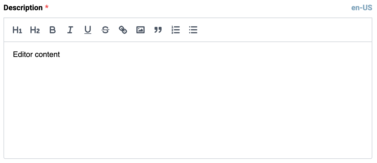
Basic Vue
You can easily incorporate the vc-editor component into your Vue applications using simple templates.
Props
To customize the appearance and behavior of your editor, use the following props:
| Property and Type | Description |
|---|---|
placeholder {string} |
Placeholder text for the editor. |
modelValue {string}, {number}, {Date} |
Value of the editor |
required {boolean} |
Indicates if the editor is required. |
disabled {boolean} |
Indicates if the editor is disabled. |
label {string} |
Label for the editor. |
tooltip {string} |
Tooltip text for the editor label. |
errorMessage {string} |
Error message to display when validation fails. |
assetsFolder {string} |
Folder path for assets used by the editor uploader. |
multilanguage {boolean} |
Indicates if the editor supports multiple languages. |
currentLanguage {string} |
Current language for the editor. |
Slots
To enhance the content of the vc-editor component, use the slot system:
| Name | Description |
|---|---|
error |
Slot for error message. |
Emits
To interact with the vc-editor component, use the emitted events. The update:modelValue event is triggered when the value of the editor changes:
| Name | Parameters | ReturnType | Description |
|---|---|---|---|
update:modelValue |
value: string \| number \| Date \| null \| undefined |
Emitted when the value of the editor changes. |
Dynamic Views
To dynamically integrate the vc-editor component into your views, use the schema interface:
interface EditorSchema {
    id: string;
    component: "vc-editor";
    label?: string;
    property: string;
    rules?: IValidationRules;
    placeholder?: string;
    tooltip?: string;
    multilanguage?: boolean;
    disabled?: {
        method: string;
    };
    visibility?: {
        method: string;
    };
    update?: {
        method: string;
    };
    horizontalSeparator?: boolean;
}
To incorporate the editor into your dynamic applications, define the following properties:
| Property and Type | Description |
|---|---|
id {string} |
The unique Id for the vc-editor component. |
component {vc-editor} |
Component used in schema. |
label {string} |
Label for the editor. Also available interpolation {} syntax based on current element context. You can specify the localization key for the label. Under the hood, vue-i18n is used. |
property {string} |
Property name that is used for binding editor value to blade data. Supports deep nested properties like property[1].myProperty. Additionally, you have the flexibility to bind computed property that returns a value. Computed property should be defined in the blade scope. |
rules {IValidationRules} |
Validation rules for the editor. Uses VeeValidate validation rules. |
placeholder {string} |
Placeholder text for the editor. You can specify the localization key for the placeholder. Under the hood, vue-i18n is used. |
tooltip {string} |
Tooltip text for the editor label. You can specify the localization key for the tooltip. Under the hood, vue-i18n is used. |
multilanguage {boolean} |
Specification whether the editor supports multiple languages. |
disabled {{method: string}} |
Disabled state for component, could be used to disable editor based on some conditions. Method or variable should be defined in the blade scope and should return a boolean value. |
visibility {{method: string}} |
Visibility state for component, could be used to hide editor based on some conditions. Method or variable should be defined in the blade scope and should return a boolean value. |
update {{method: string}} |
Method to call when the editor value is updated. It gets changed value, schema property name and field internal context as arguments. Method should be defined in the blade scope. |
horizontalSeparator {boolean} |
Adds a horizontal separator line after the component. |